Bembo
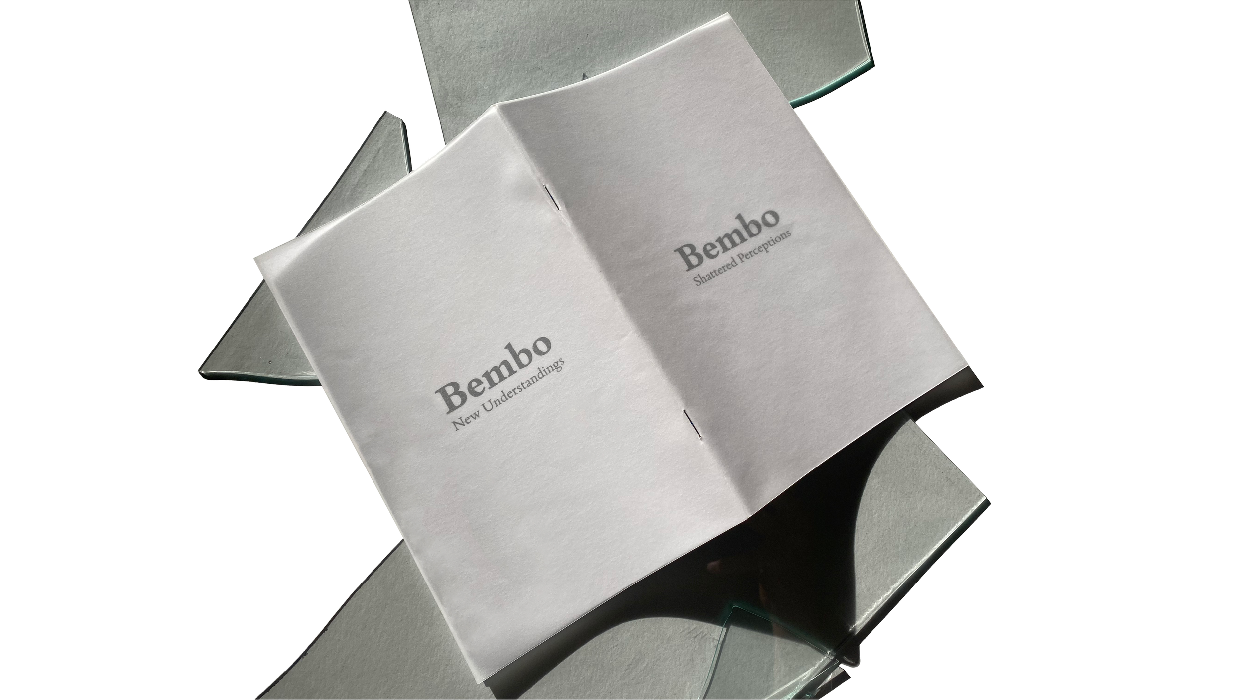
Shattered Perceptions, New Understandings
Type:
Bembo
Software:
Adobe InDesign Adobe Photoshop
Dimensions:
5" by 8"
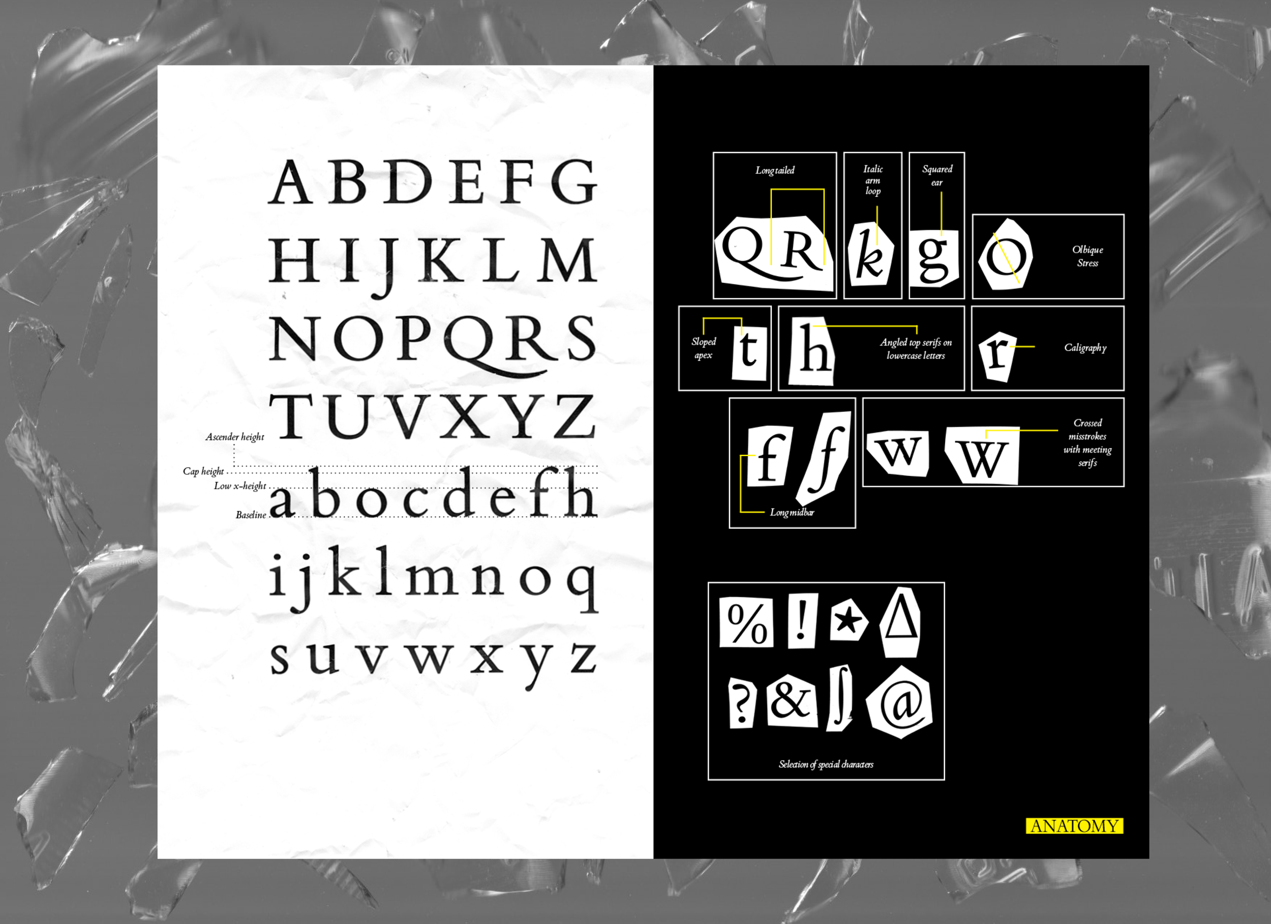
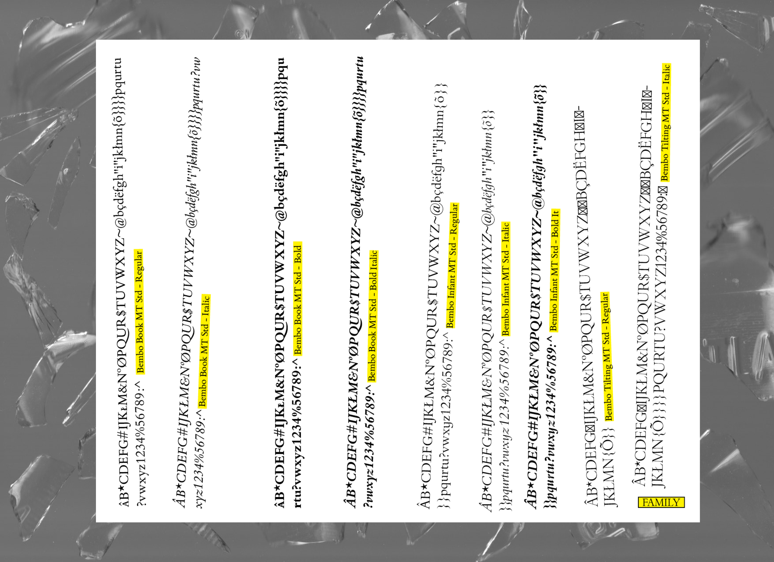
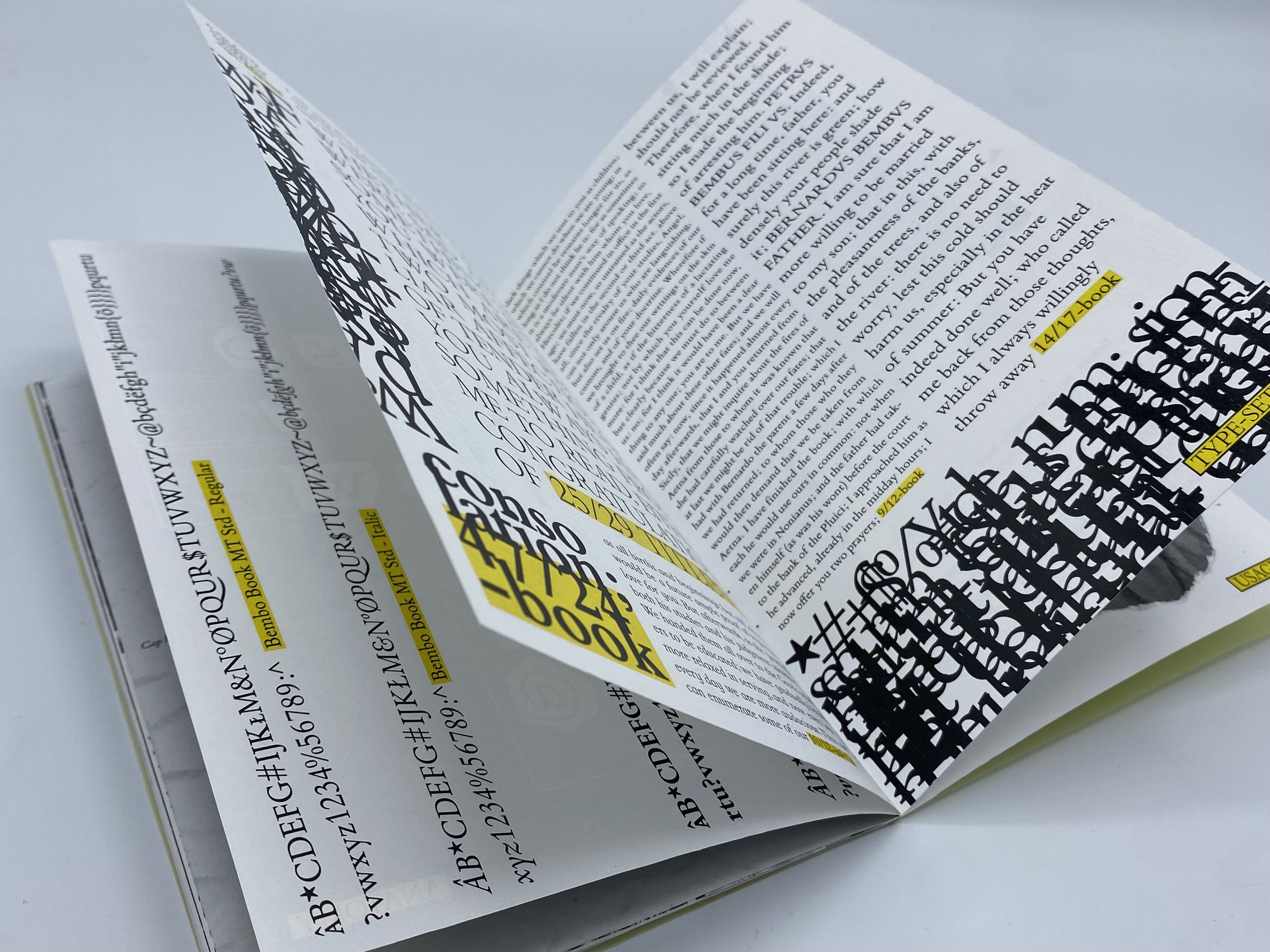
Description: Bembo is a serif typeface created by the British branch of the Monotype Corporation in 1928–1929 and most commonly used for body text. It is a member of the "old-style" serif fonts, with its regular or Roman style based on a design cut around 1495 by Francesco Griffo for Venetian printer Aldus Manutius, sometimes generically called the "Aldine Roman." Bembo is named for Manutius's first publication with it, a small 1496 book by the poet and cleric Pietro Bembo.
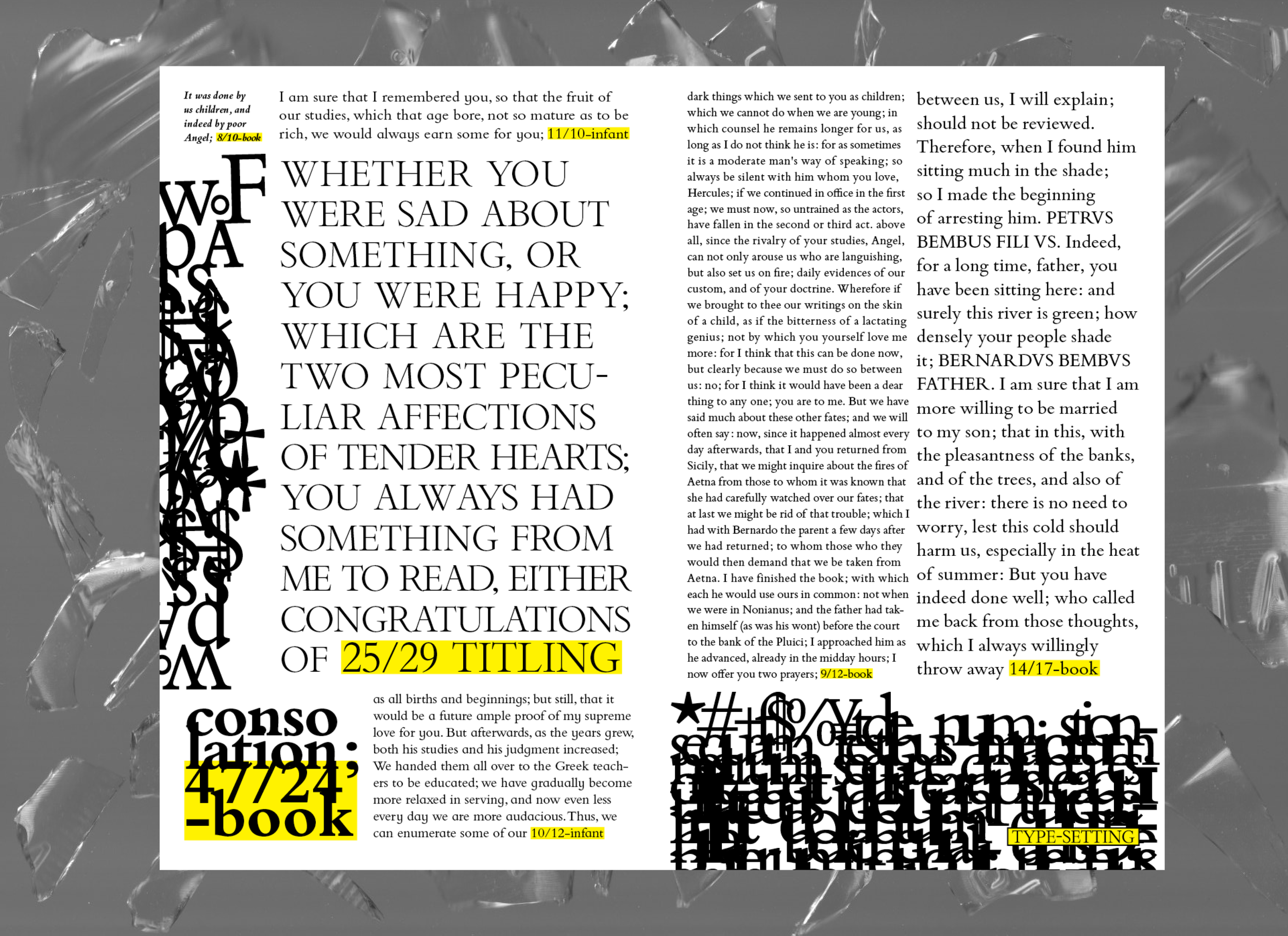
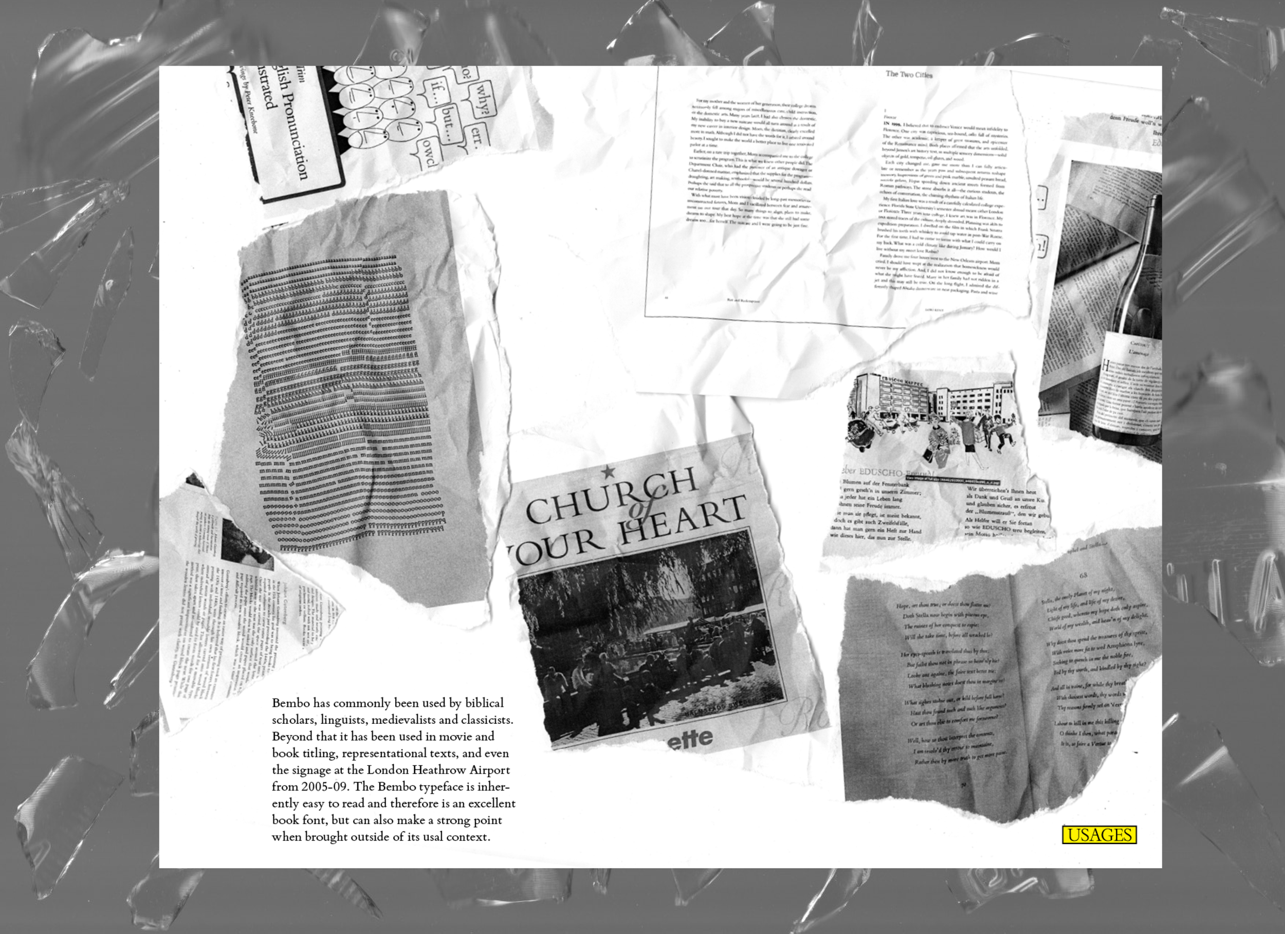
Objective: Craft a type specimen book to promote the typeface Bembo and highlight its uses and features.
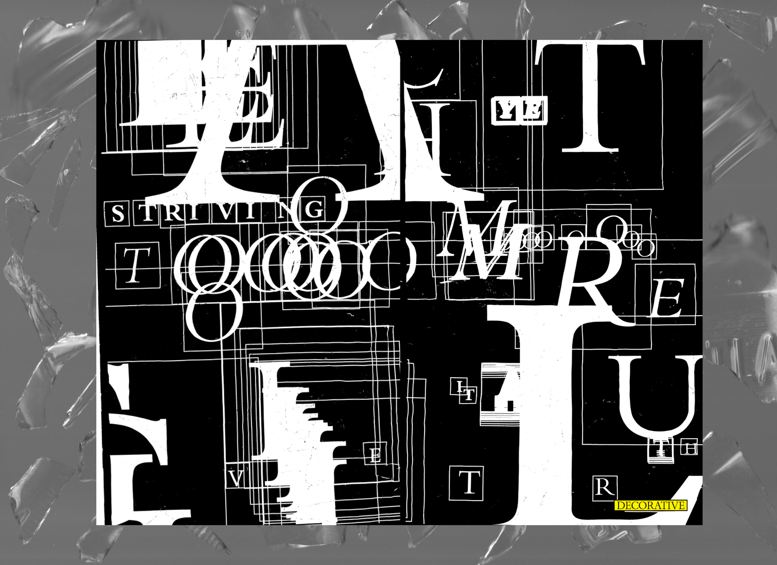
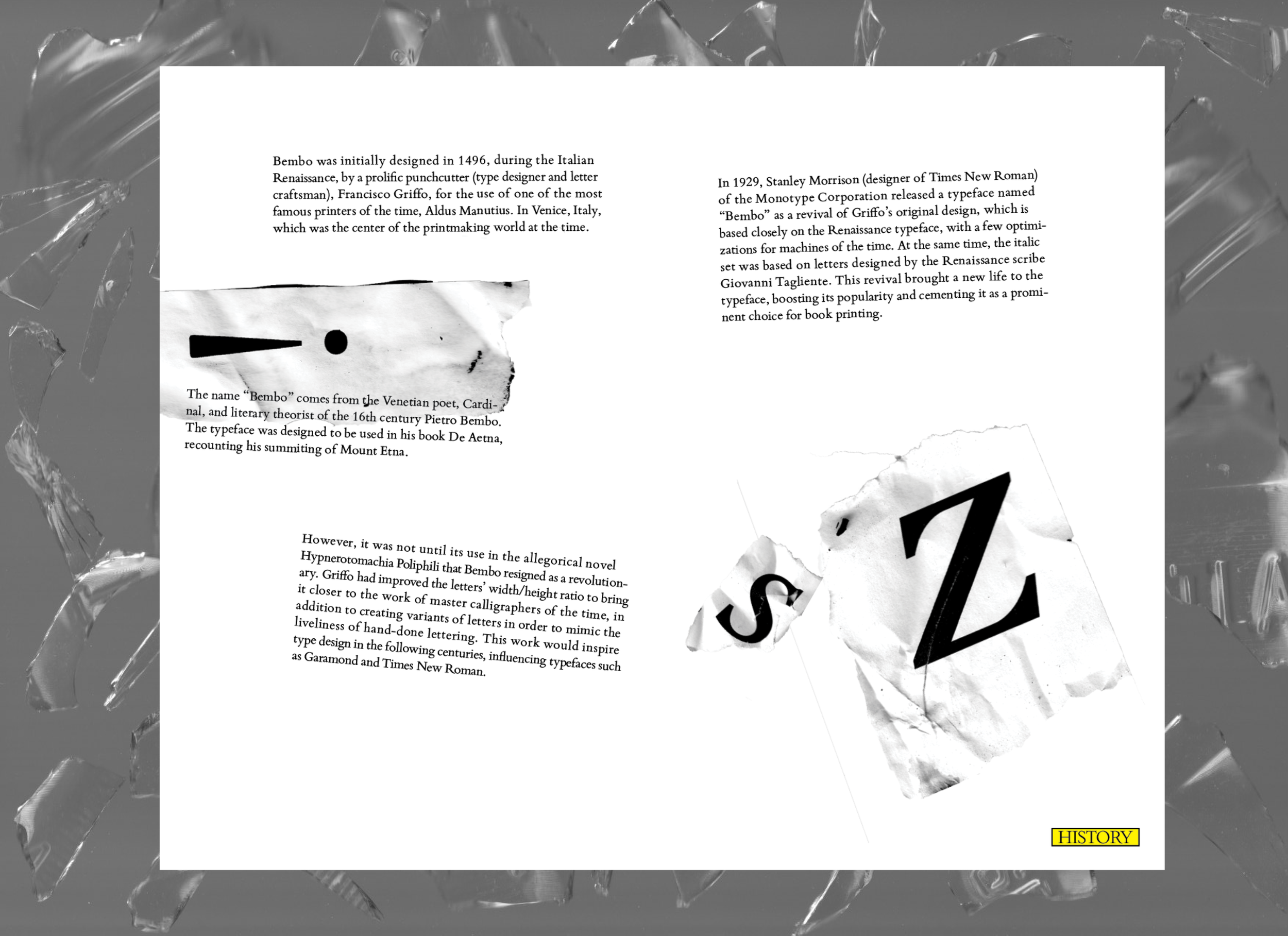
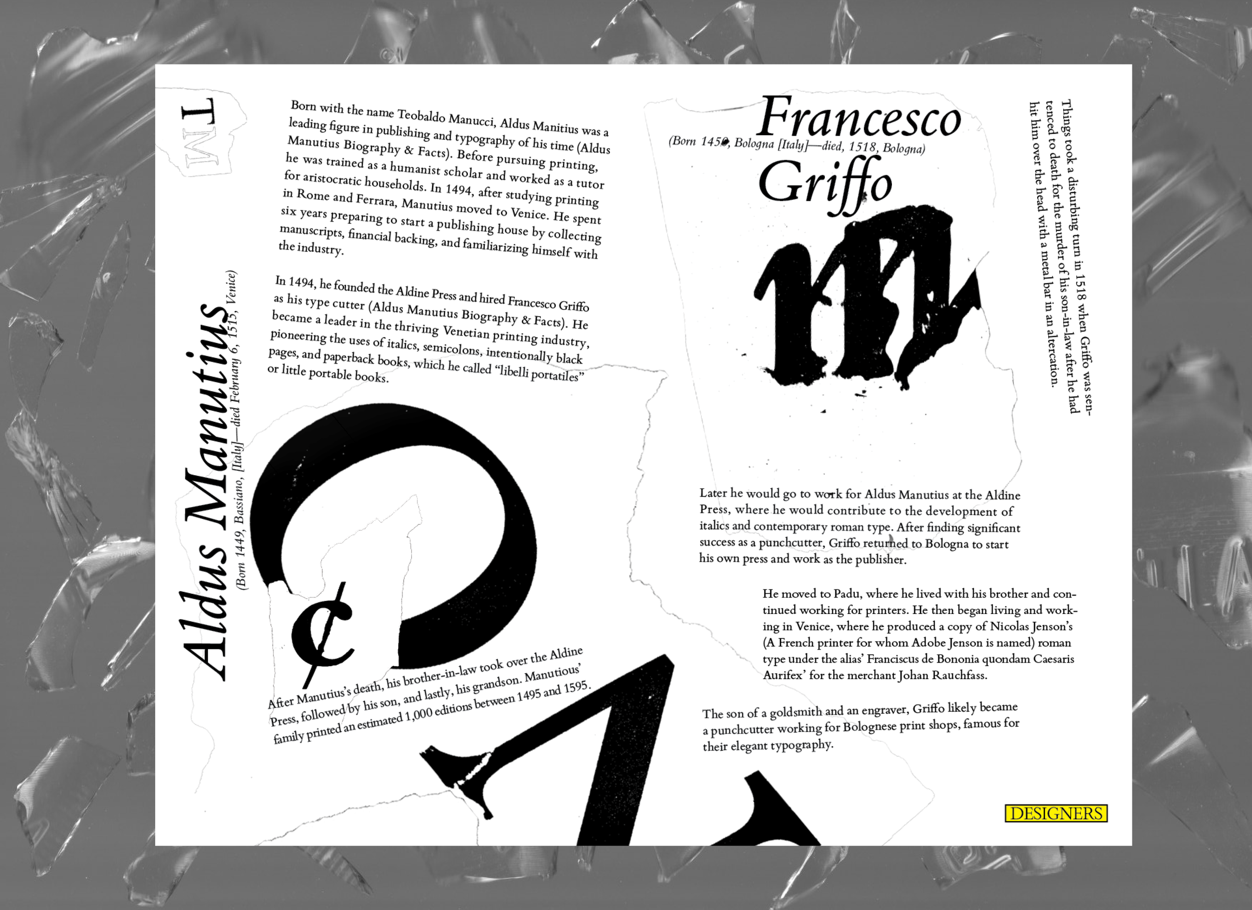
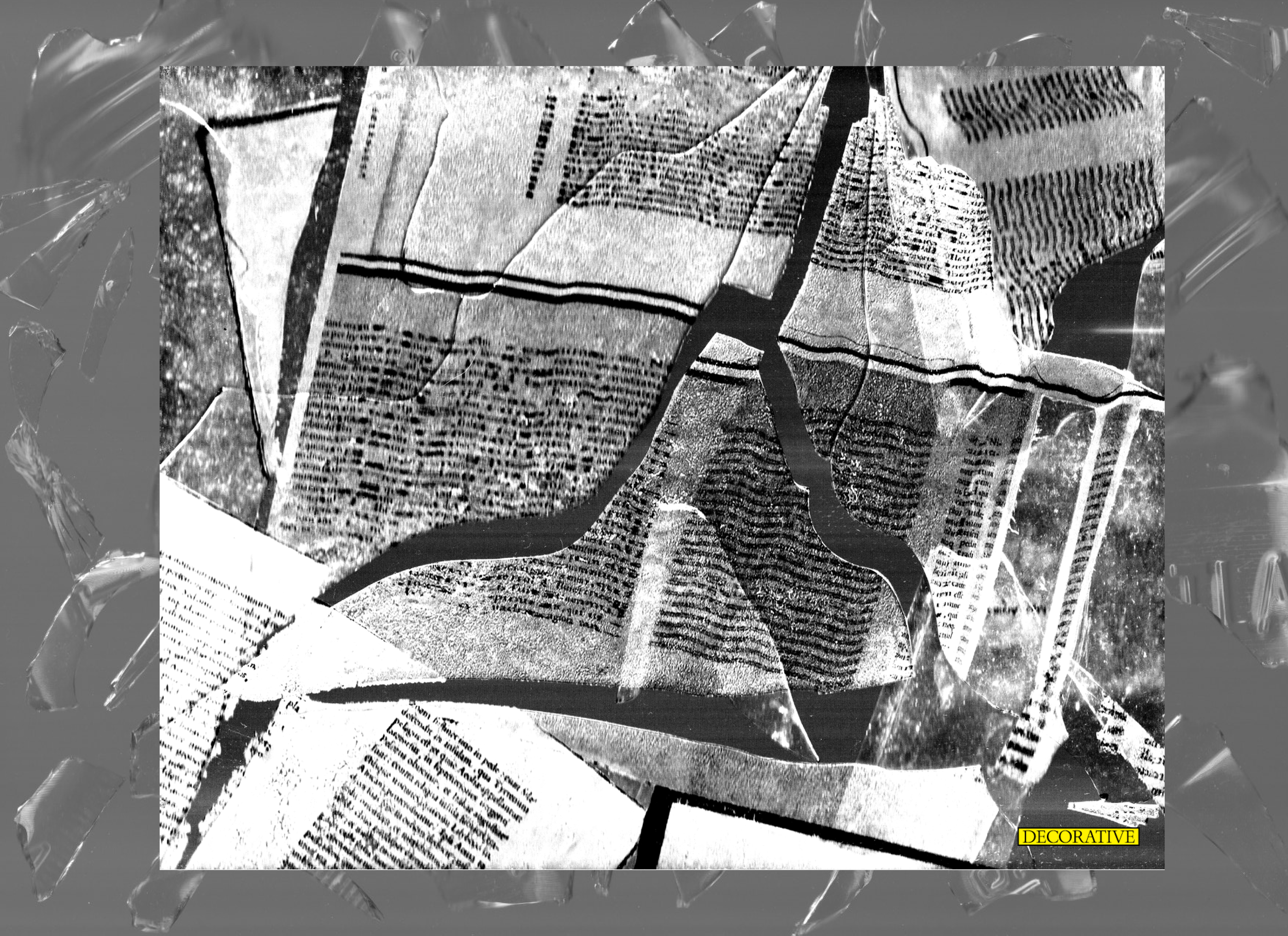
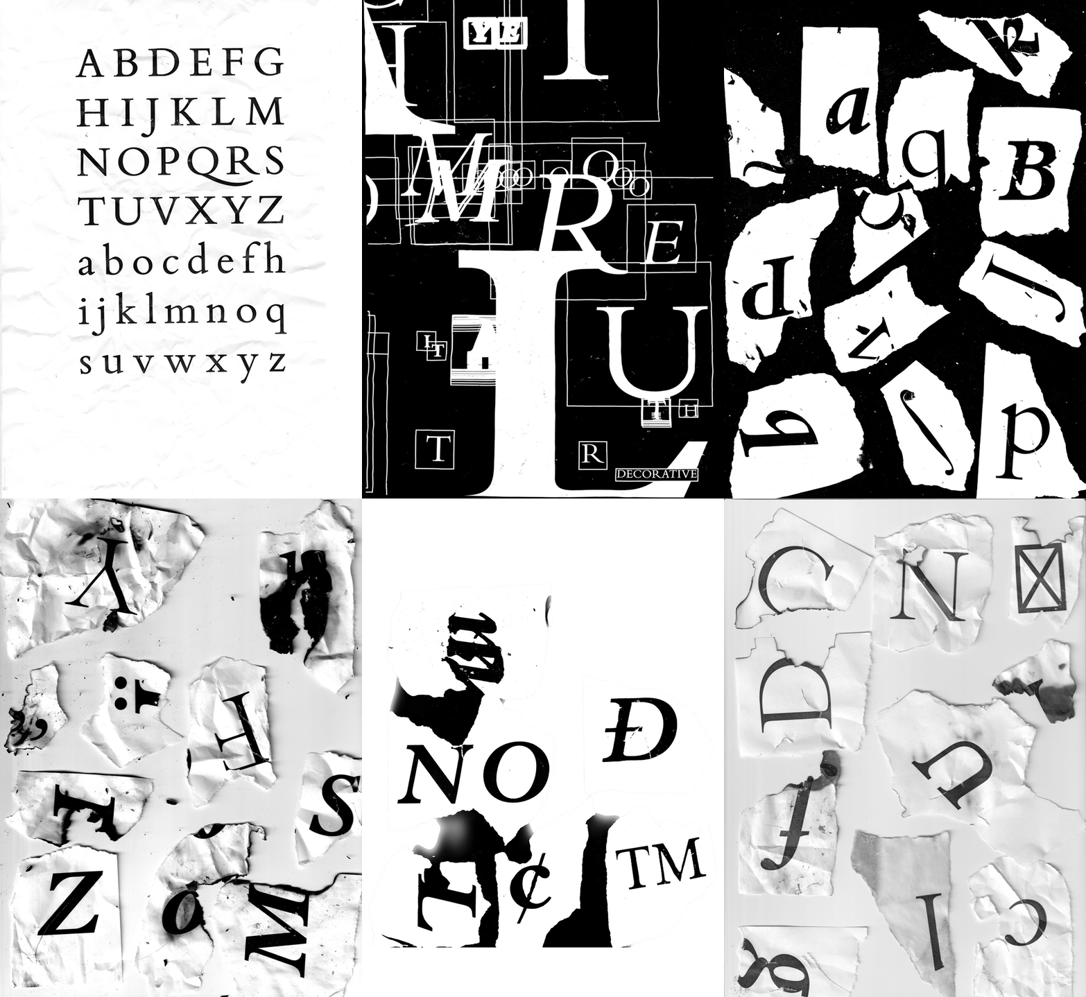
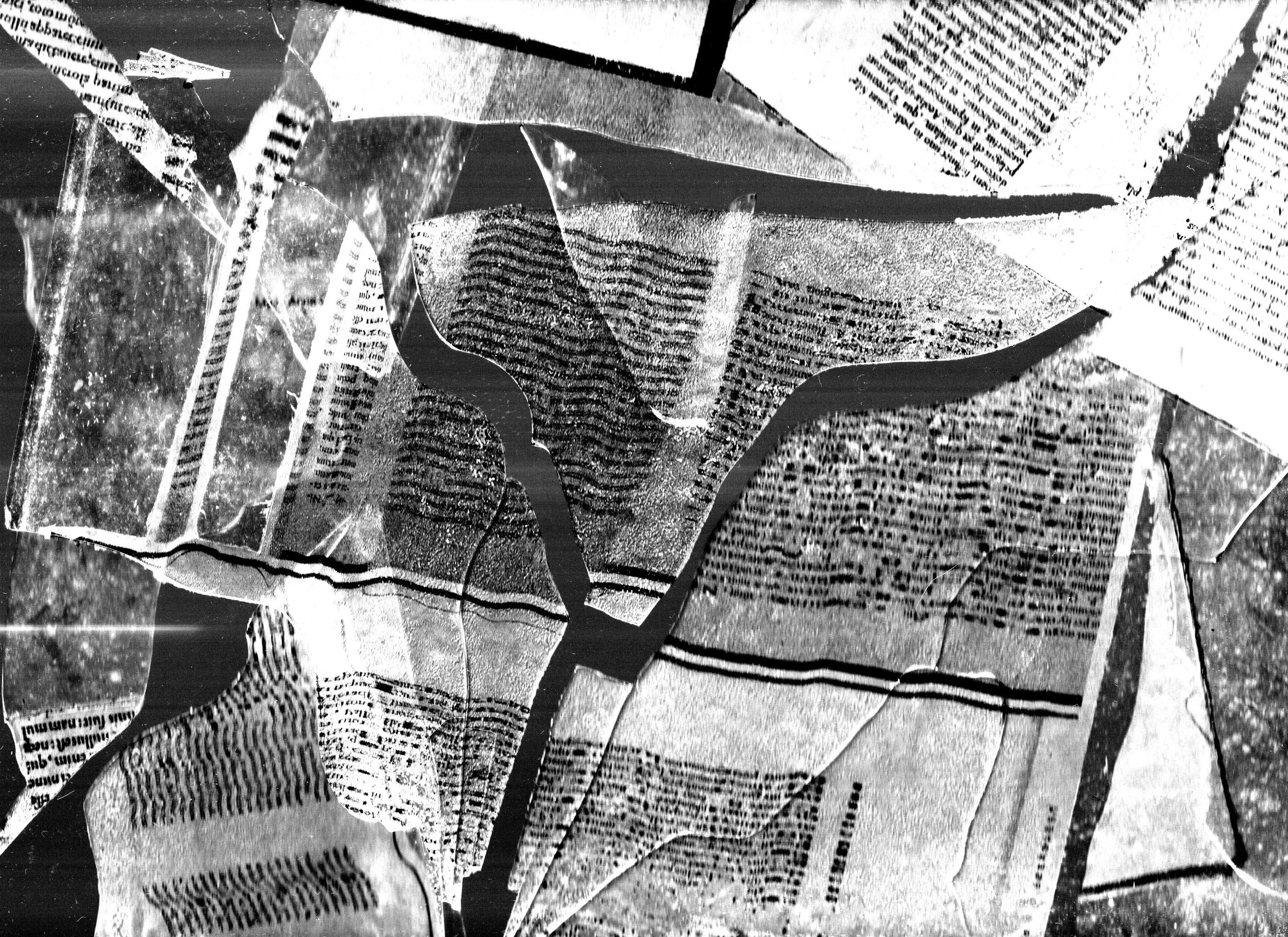
Solution: A type specimen book that subverts common associations and uses of Bembo and instead shows it in a grungier, more contemporary light. Using scans of burnt and torn paper as well as shattered glass to convey a sense of anger and dynamism.
Scans
Scanning was an essential part of my process and concept. Initially, I was exploring the idea of Bembo as a Renaissance typeface. Instead, I decided to push myself to reinvent my own ideas about Bembo in order to promote it in a new light. I wanted to explore the themes of frustration, destruction, and reinvention through physical and print media. These letterforms have been burnt, ripped, crumpled, and even run over with a car, and then returned to their comfortable home in an InDesign spread.
